Scroll to explore
Scroll to explore
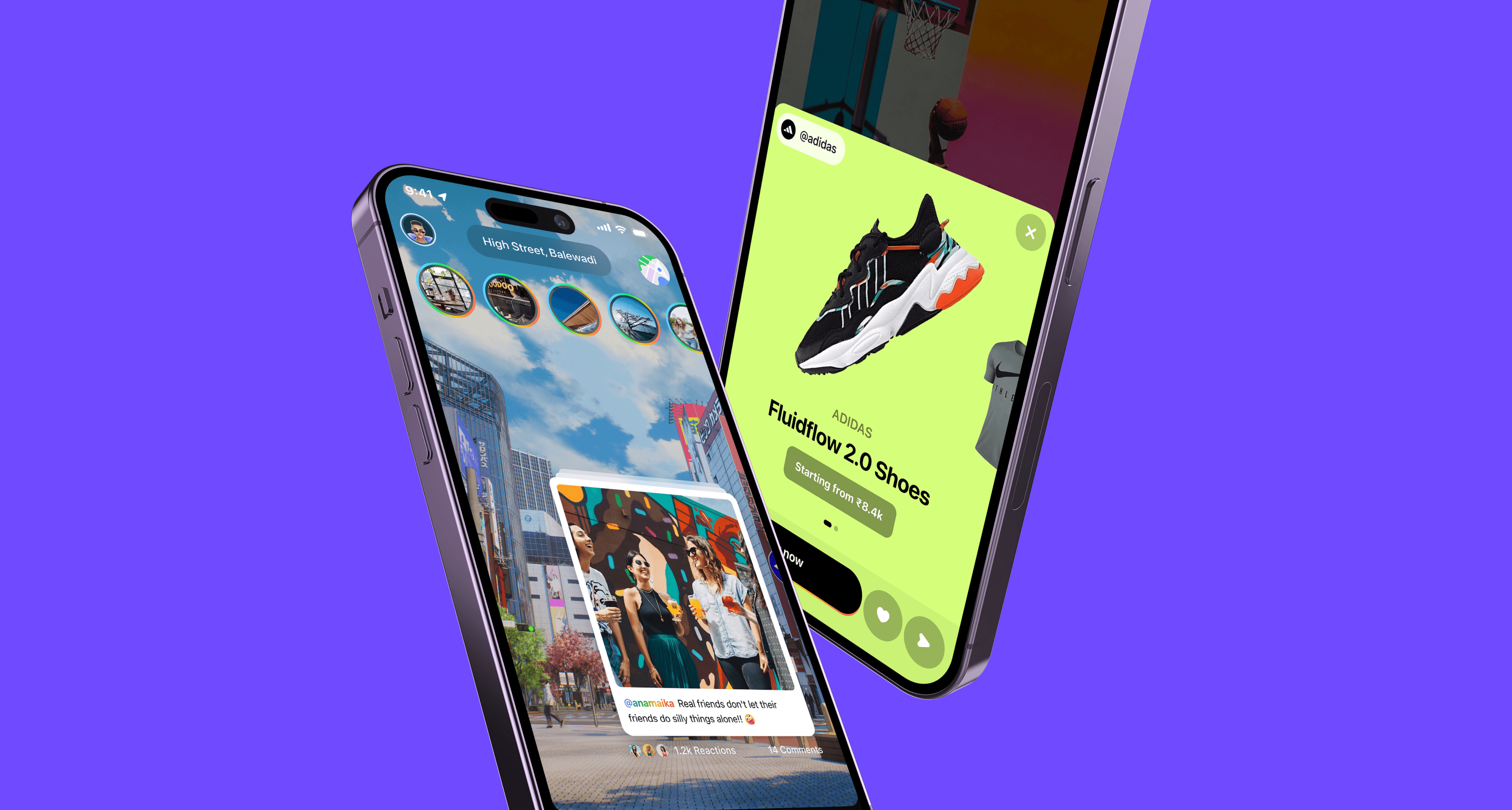
I was brought in to design a new, state-of-the-art user
experience as impressive and exhilarating as the tech itself.
From establishing brand identity to designing final product
Scroll to see how I approached design
Phase 1
Logo & Brand Identity
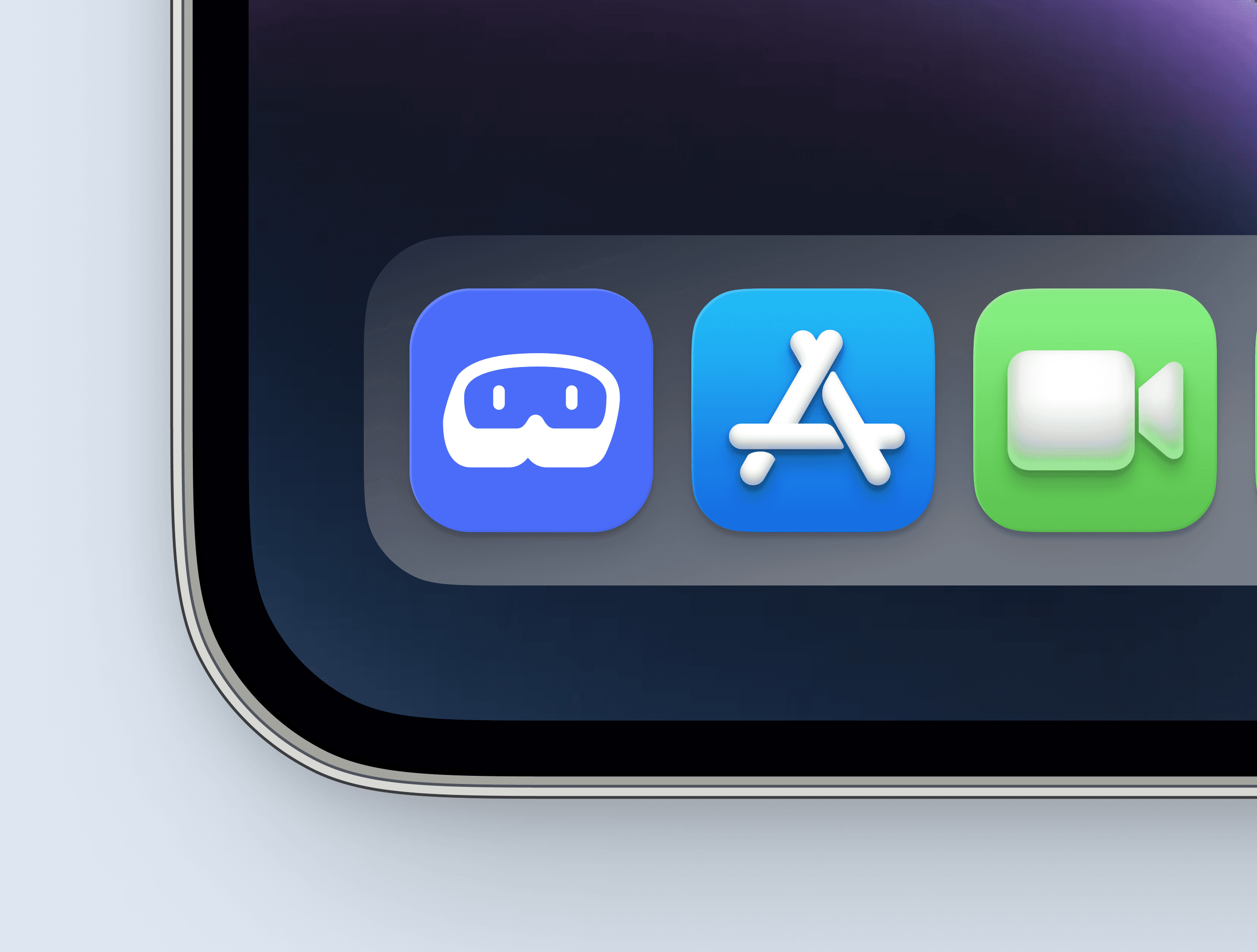
Started by crafting an easily recognisable and scalable brand identity
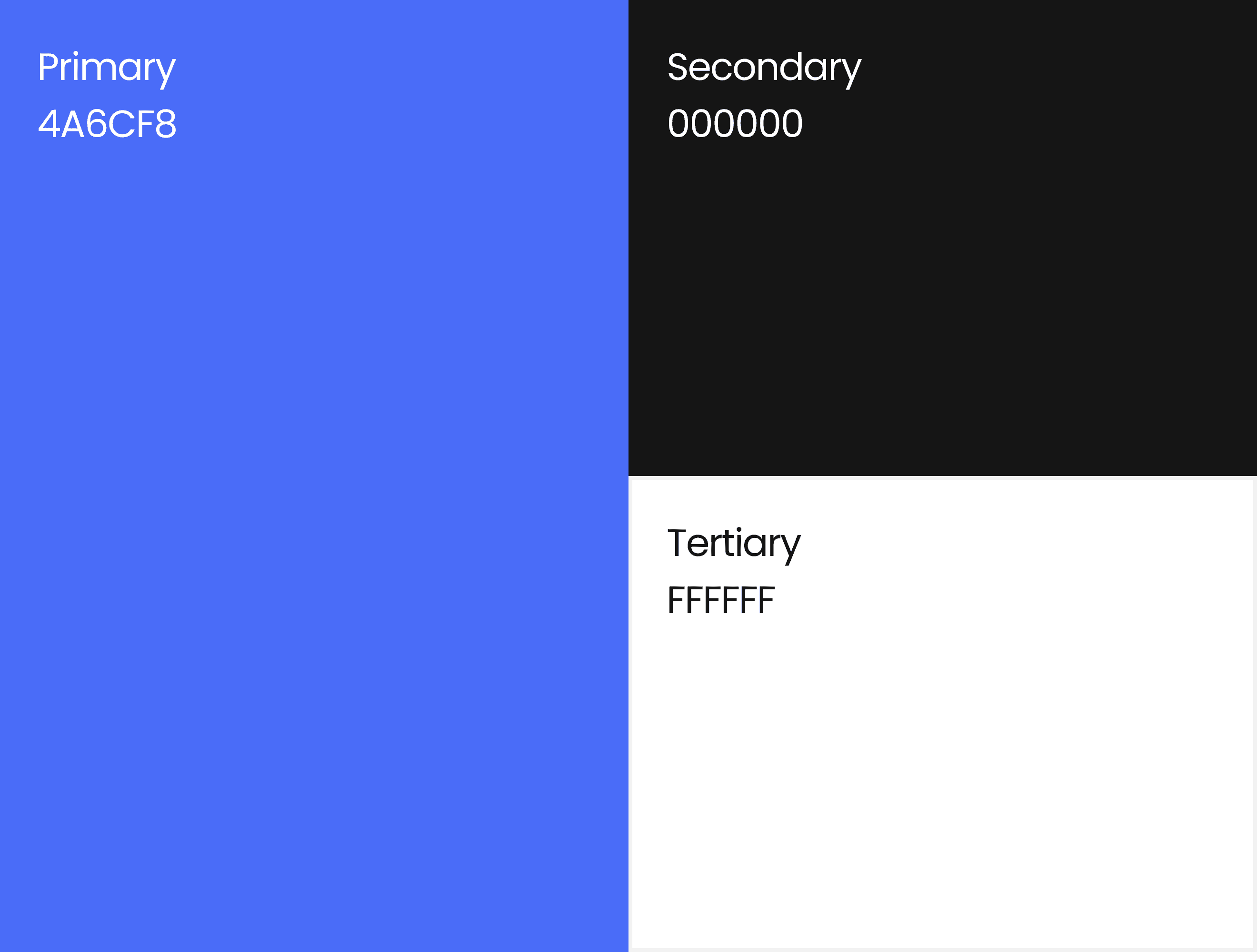
We started our journey by designing a stunning brand identity for our app such as logo, colour & styles.
The aim was to craft a logo that was distinct, yet related to new technology. We wanted to capture our brand essence in a modern, eye-catching design.
Bold & Vibrant - Designed a logo that is both visually appealing and memorable for our users as well as easily scalable and adaptable in all circumstances.


Phase 2
Target Audience
Understanding users & their mental models to craft a user-centric solution
In-depth understanding of the users was key to crafting a user-centric solution.
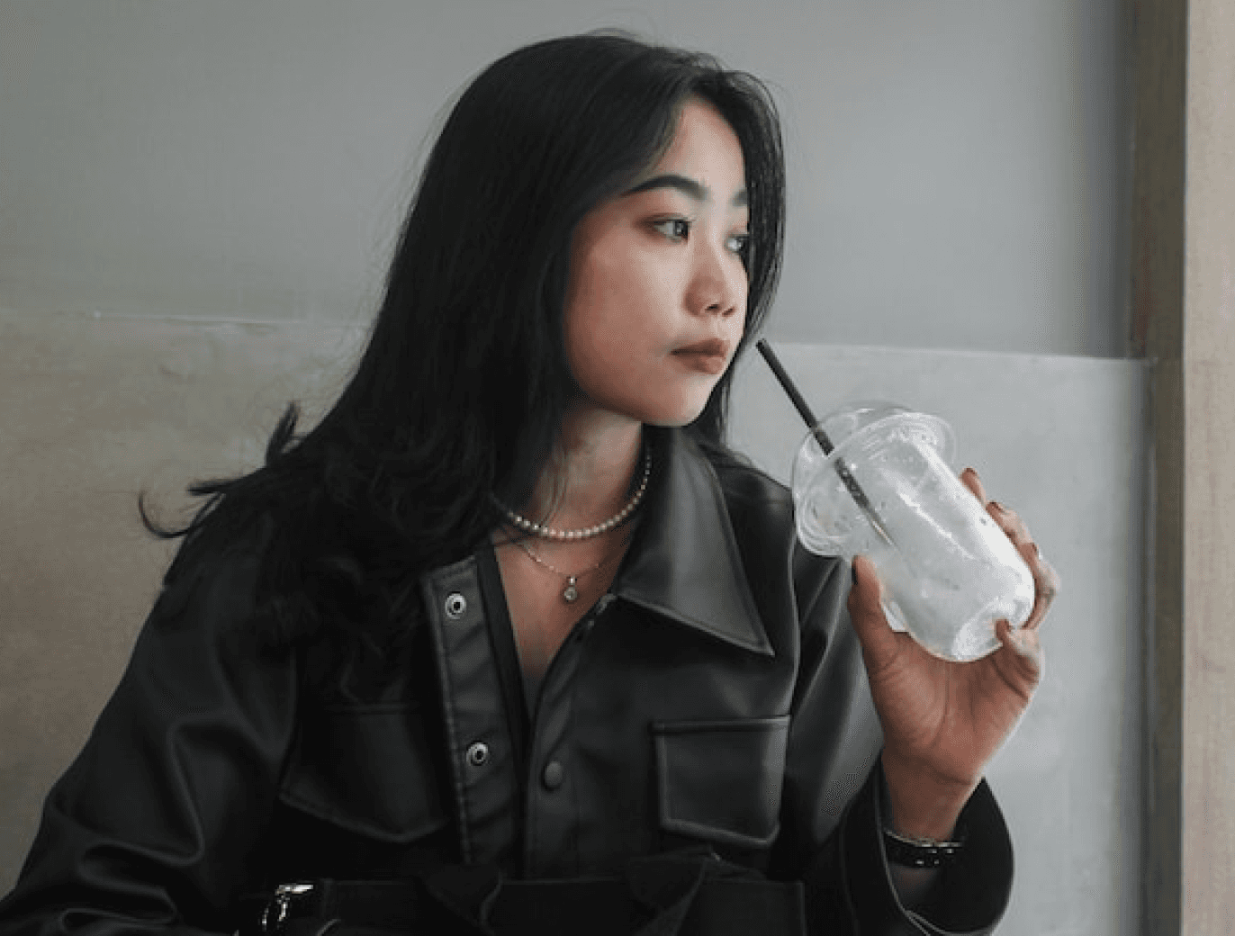
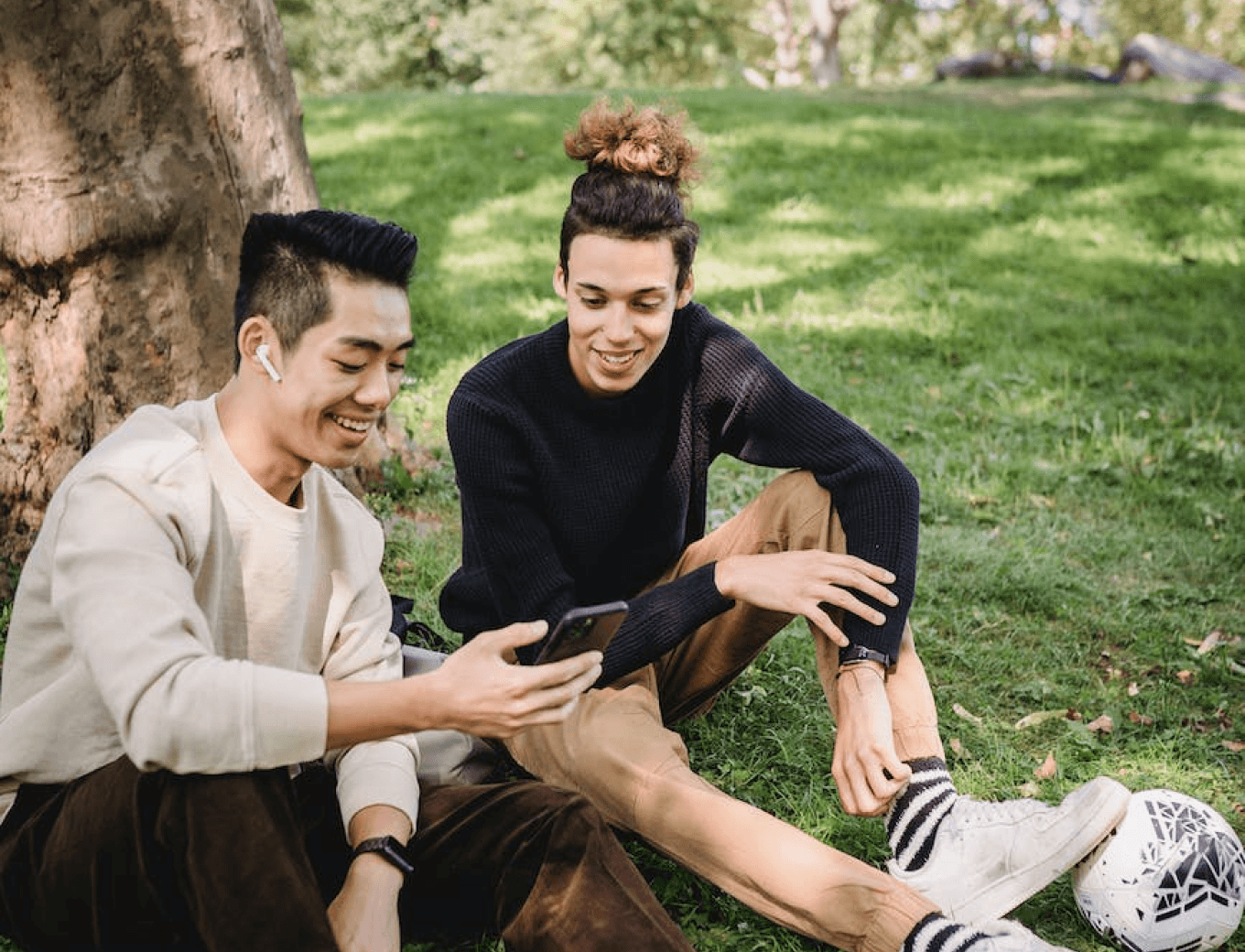
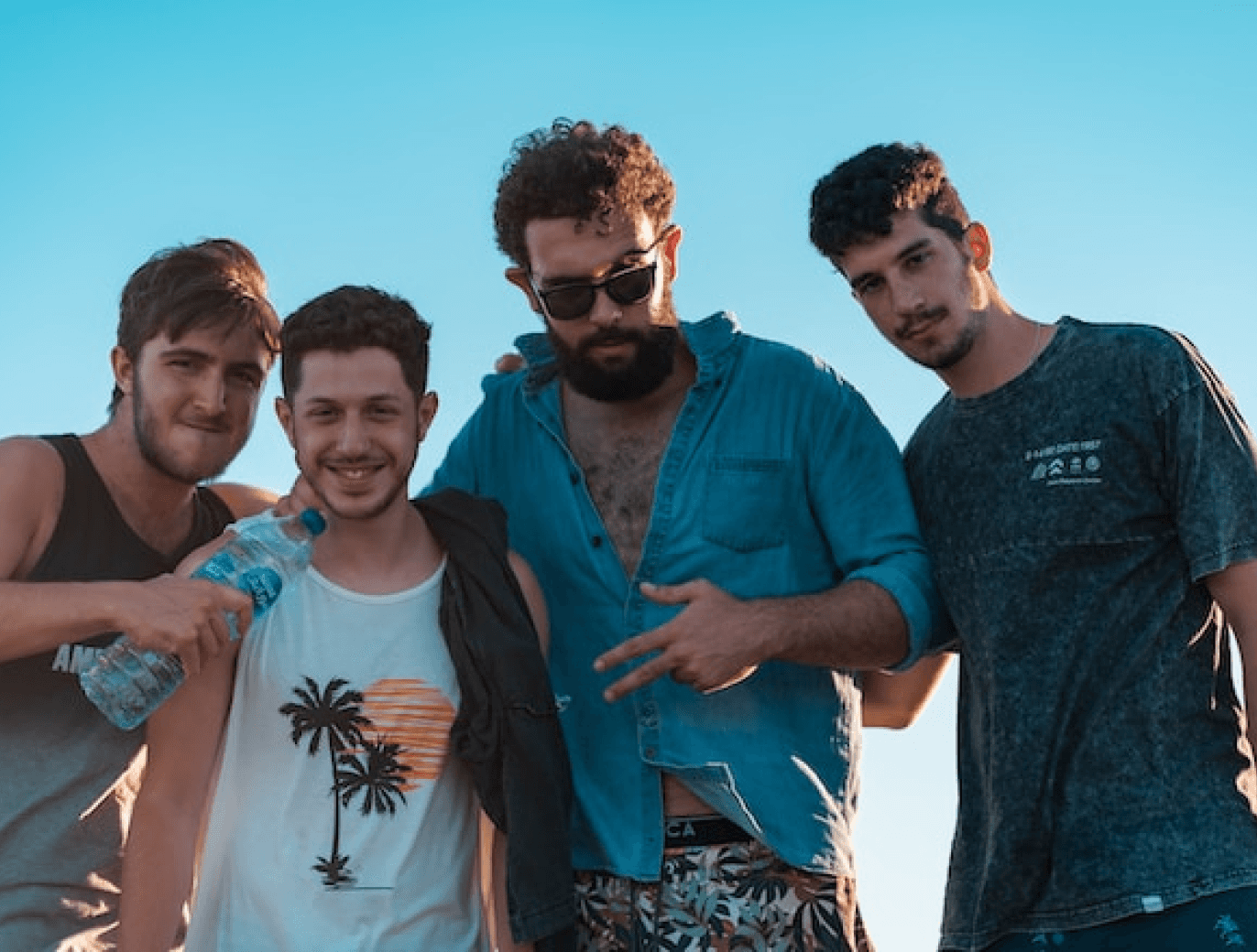
I began researching users, situational mental models and goals to better design solutions & interactions. After some thought, consideration and desk research, we concluded on these 2 potential user personas:
GenZ Users
Millennial Users

Phase 3
Design System
Drafted a design system to achieve design harmony in a product
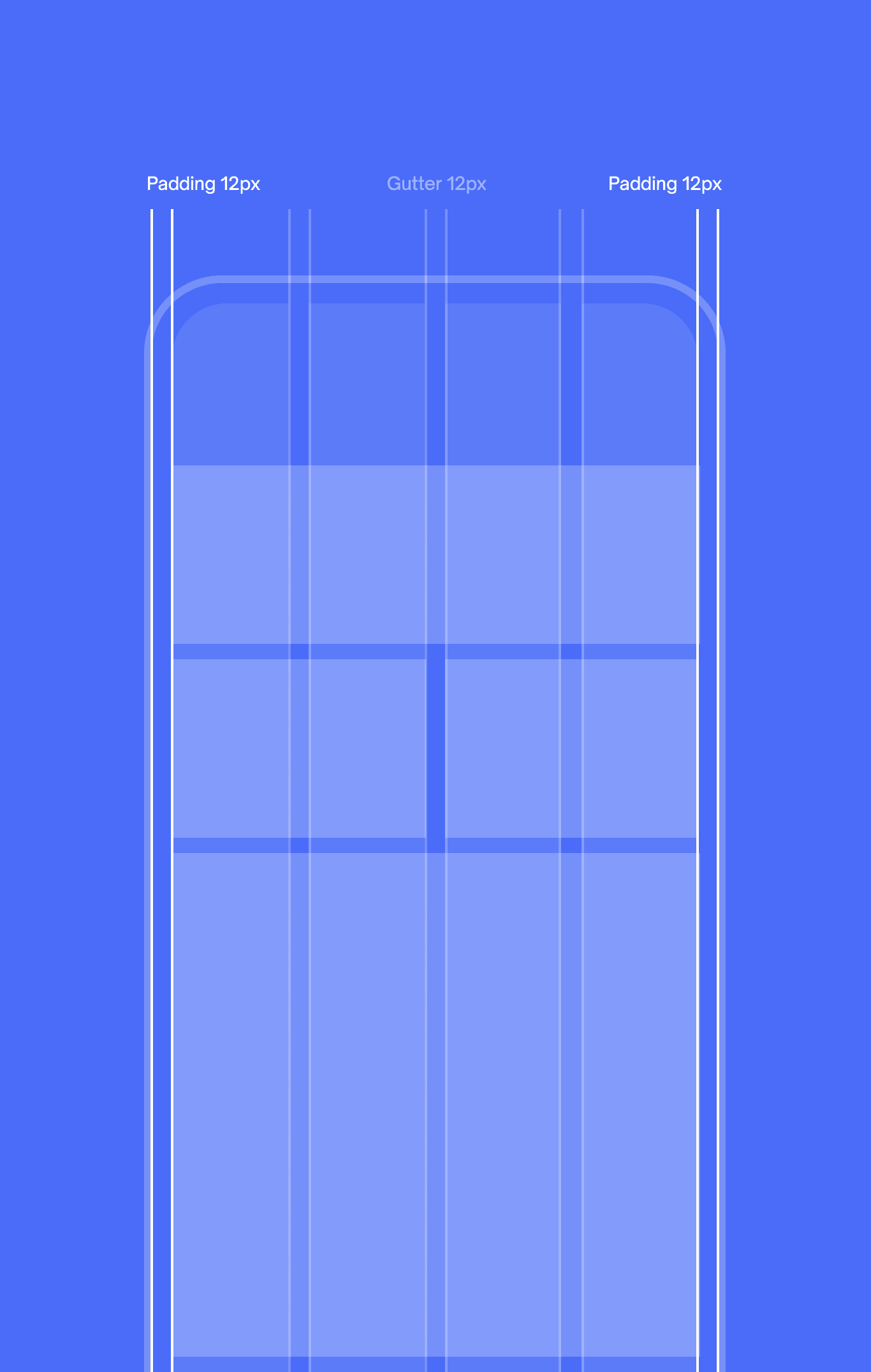
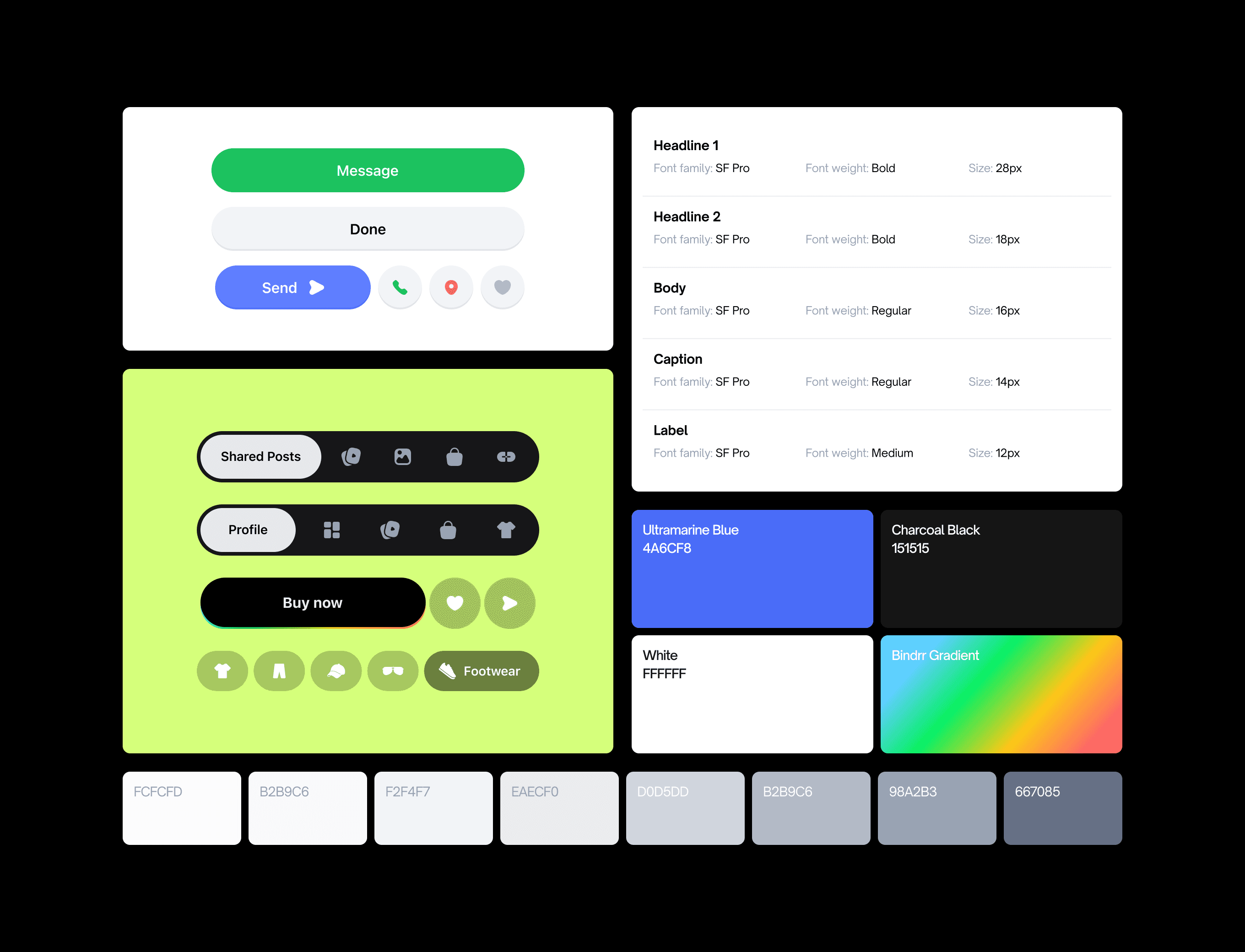
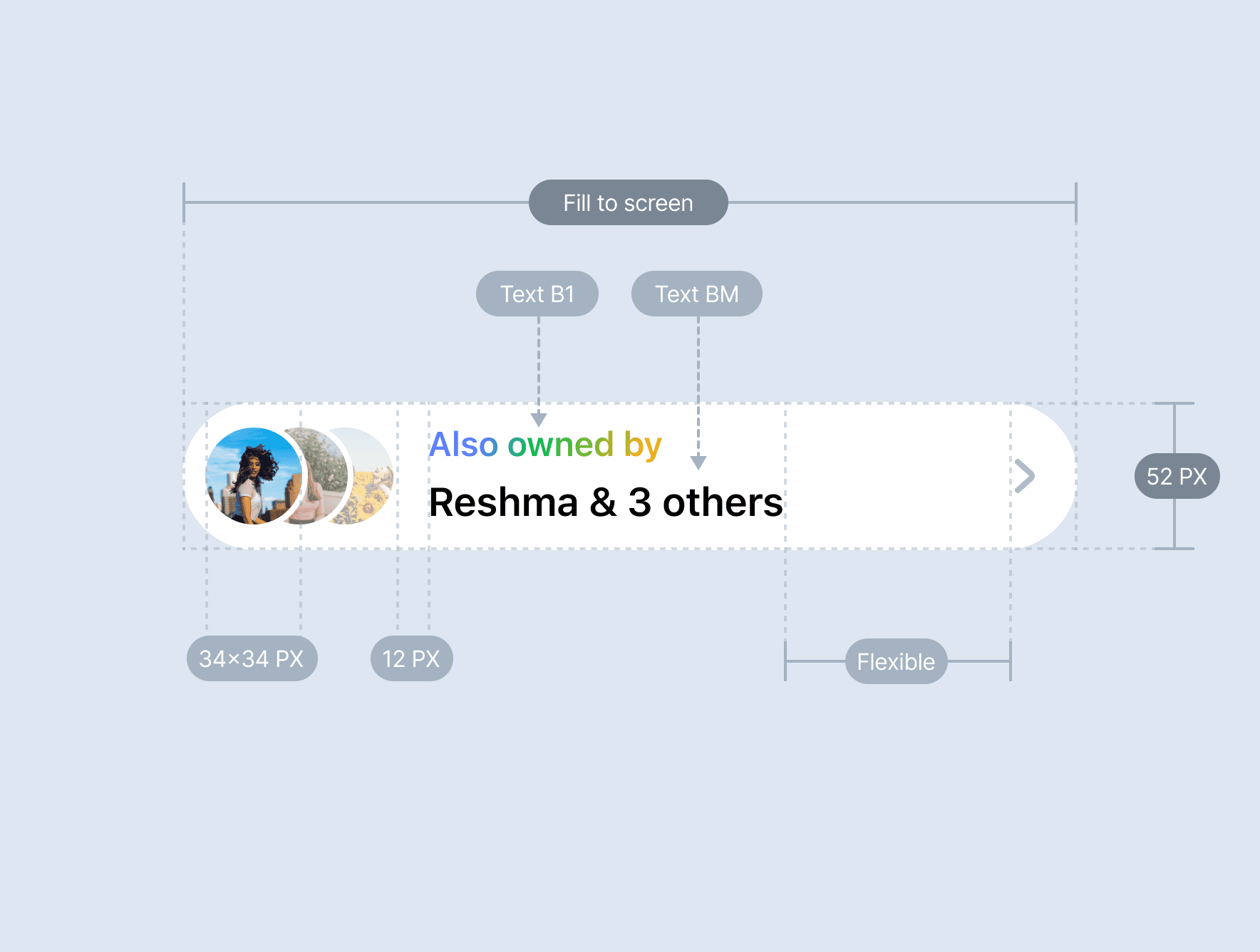
To ensure consistency and harmony throughout the product, I drafted an initial Design System before diving into the UI design.
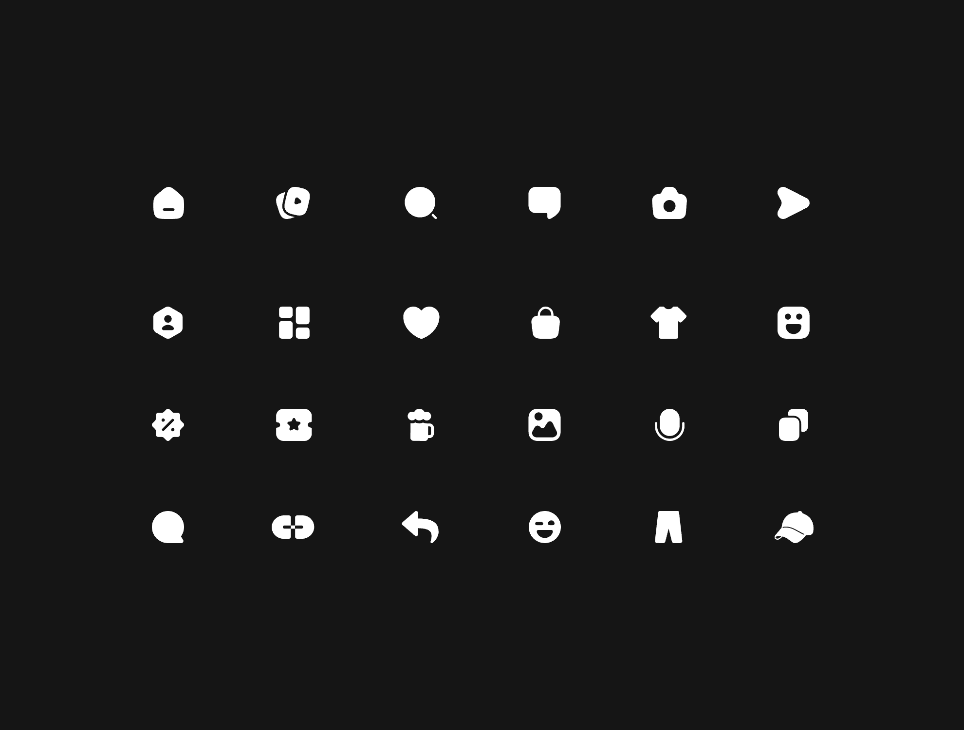
To begin, I predefined basic elements in the design system, such as colours, fonts, sizes, components, and icon styles, etc.
The design system kept evolving during the design process as required.
Phase 4
Product Design
Final Designs: unlimited creative freedom, limited resources & bandwidth
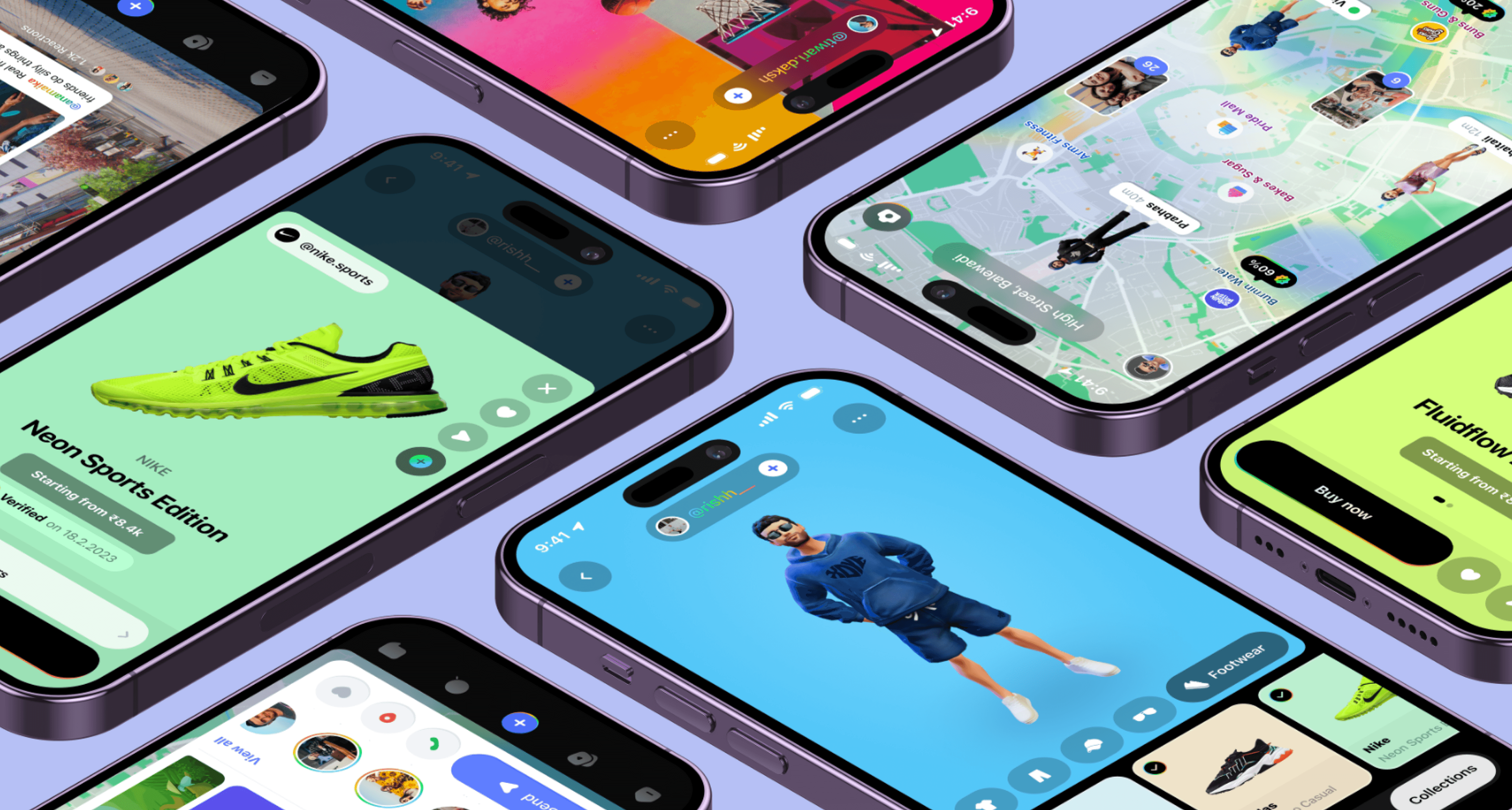
Finally, I began designing the interface and experience of the product after all the above stages.
As a new-age startup, despite my creative freedom, we didn't have enough resources and bandwidth to bring all the ideas to life.
One of the biggest challenges was designing a novel, never-before experience in one application for two very different audiences.
To achieve this, my approach to design was:
01.
Unique yet familiar
The interface & experience of the app are designed to make it feel fresh and familiar at the same time; familiar and comforting, but with an extra spark of newness.
Designed a unique balance between the innovation of the latest tech and the comfort of a well-known interface.
02.
Clean, Bold & Engaging
I took a minimal and bold approach while designing the interface to enhance usability & adaptability.
Used vibrant and eye-catchy colours to make the interface more engaging & visually appealing.
Added a lot of micro-interactions & interactive elements to make it more enjoyable - keeping users engaged.
FEATURE 1
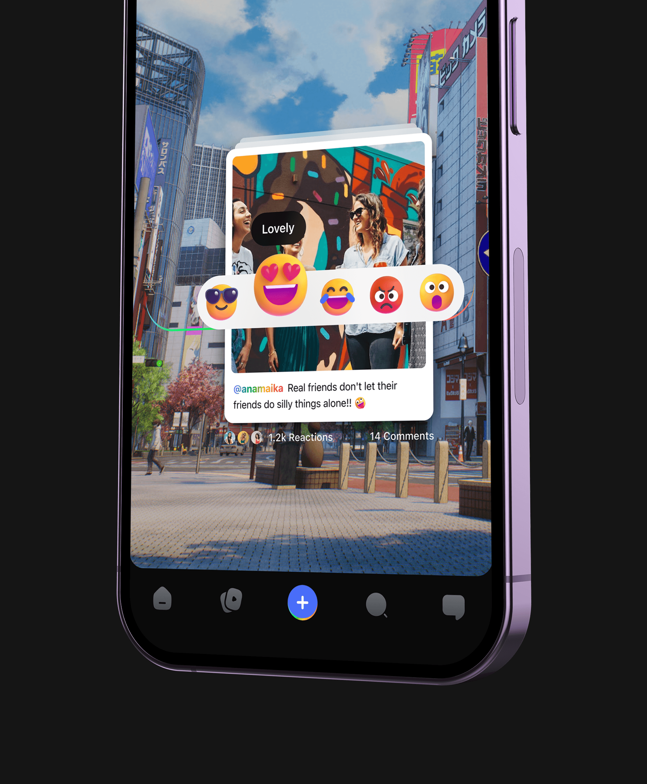
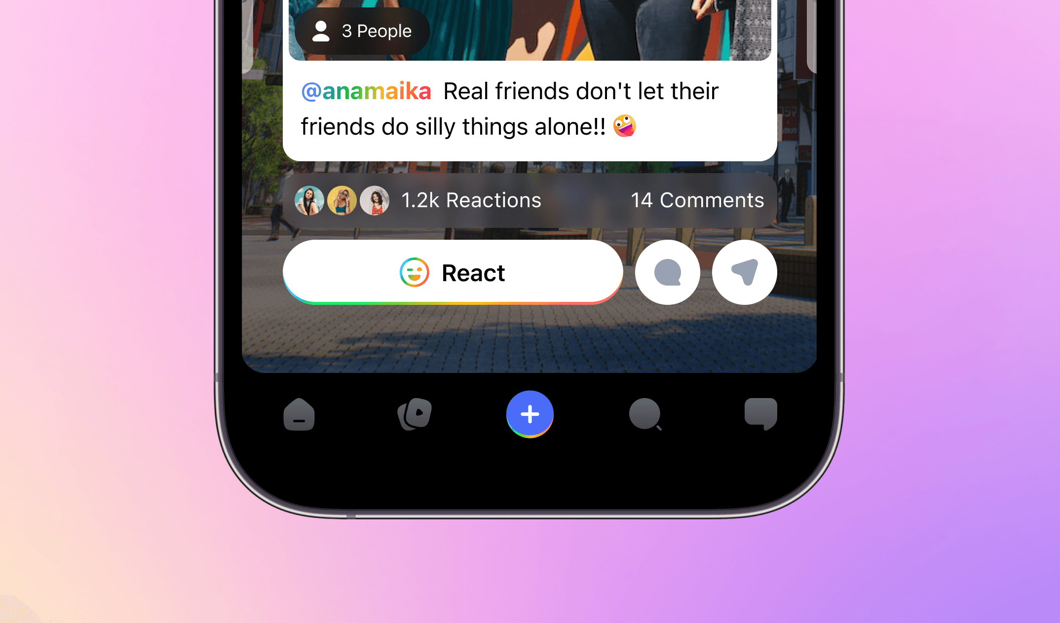
Explore new reality with Bindrr AR
The star-feature of the app; let users discover and interact with the nearby content in AR by simply scanning the surroundings.
Specially designed to engage users with the nearby content such as images, videos & texts.
FEATURE 2
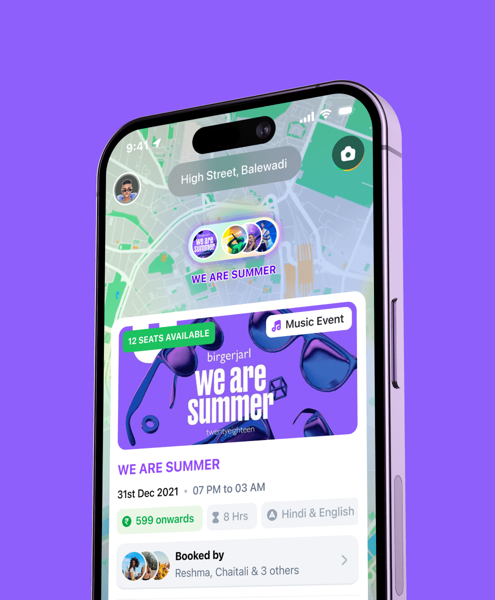
Discover the world from home through
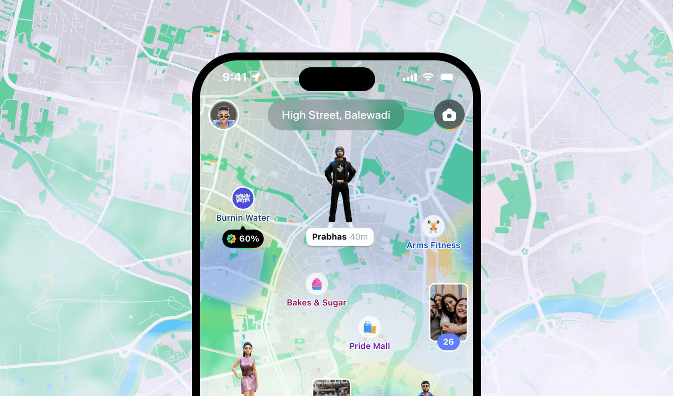
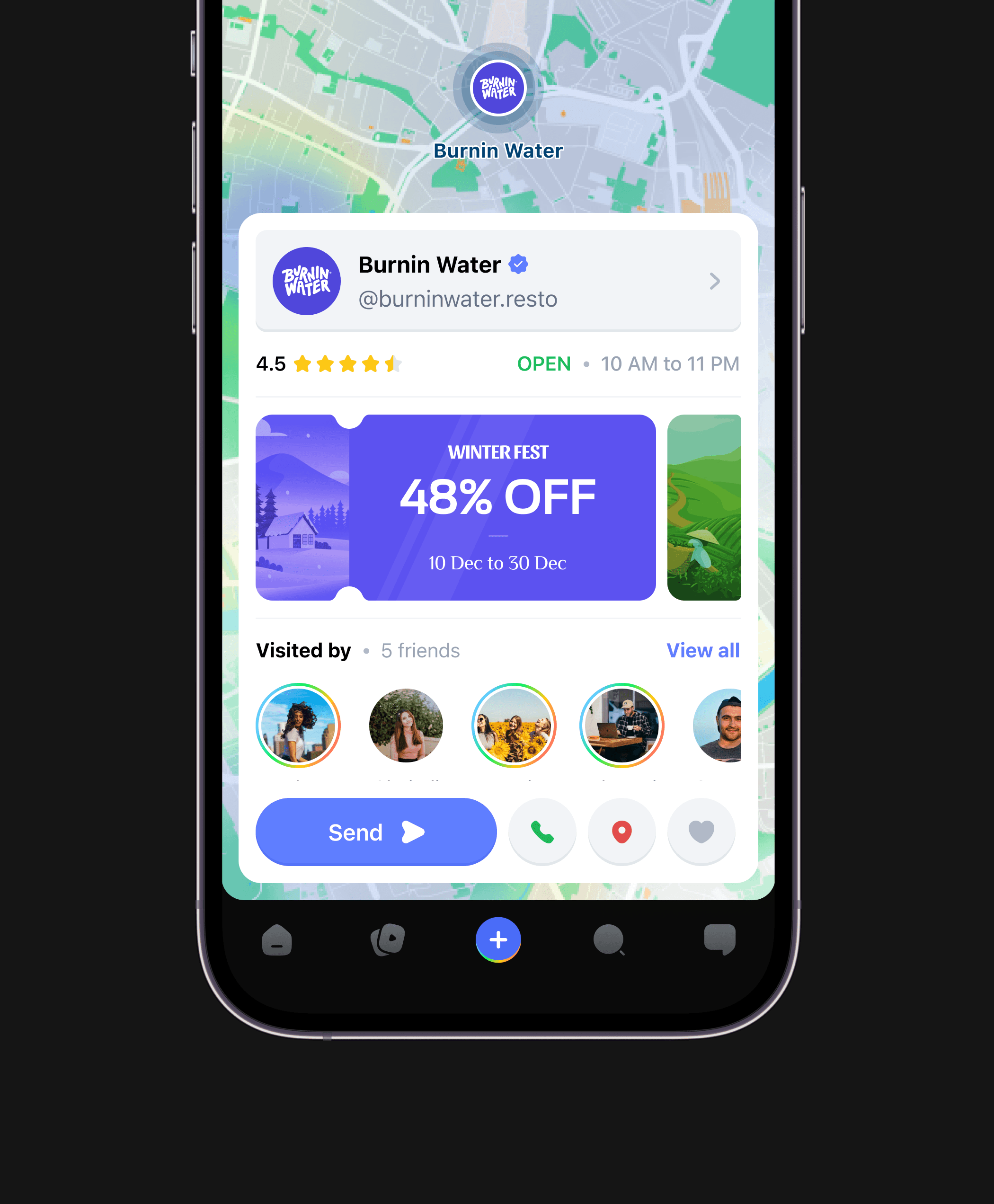
AR Map
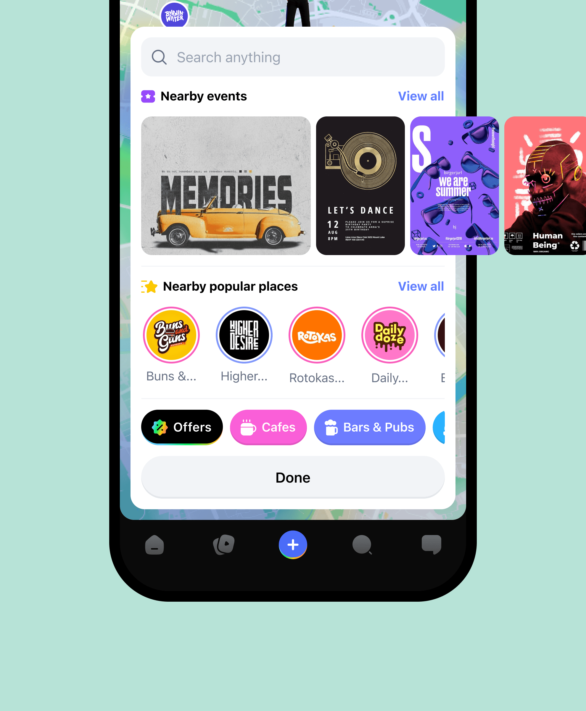
AR Map allows users to dive into a world of limitless entertainment, discovering everything from exclusive offers to concerts from the comfort of their couches.
Users can filter and customize their experience, making it more personalized & interactive.
FEATURE 3
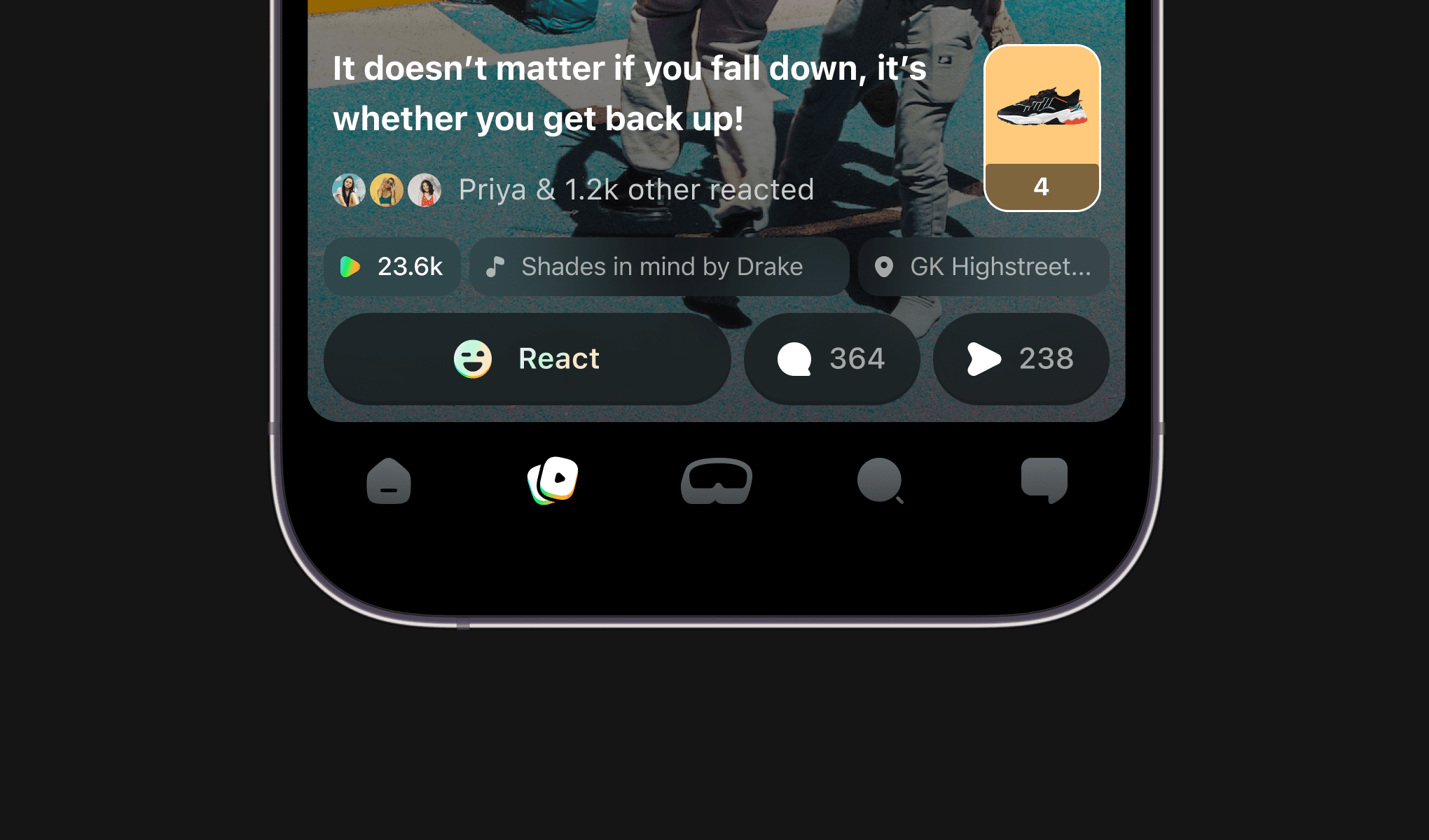
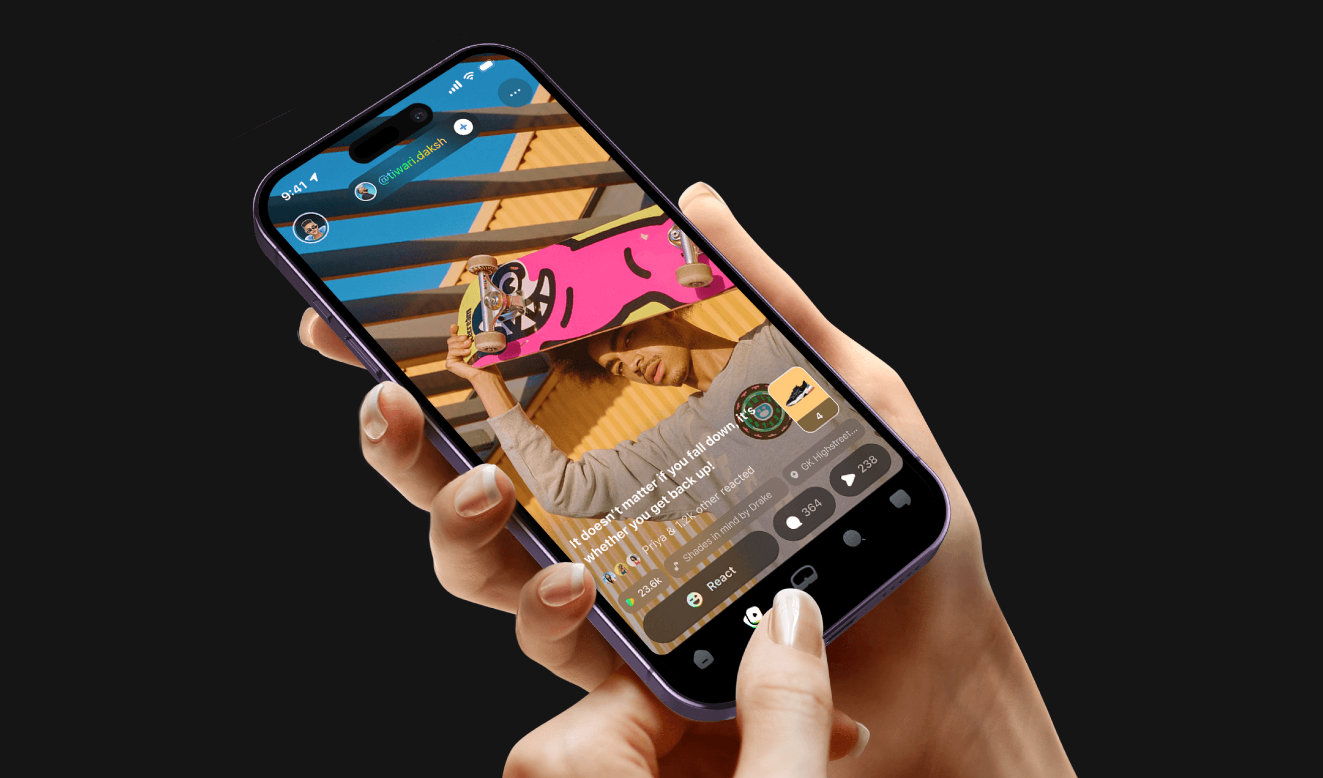
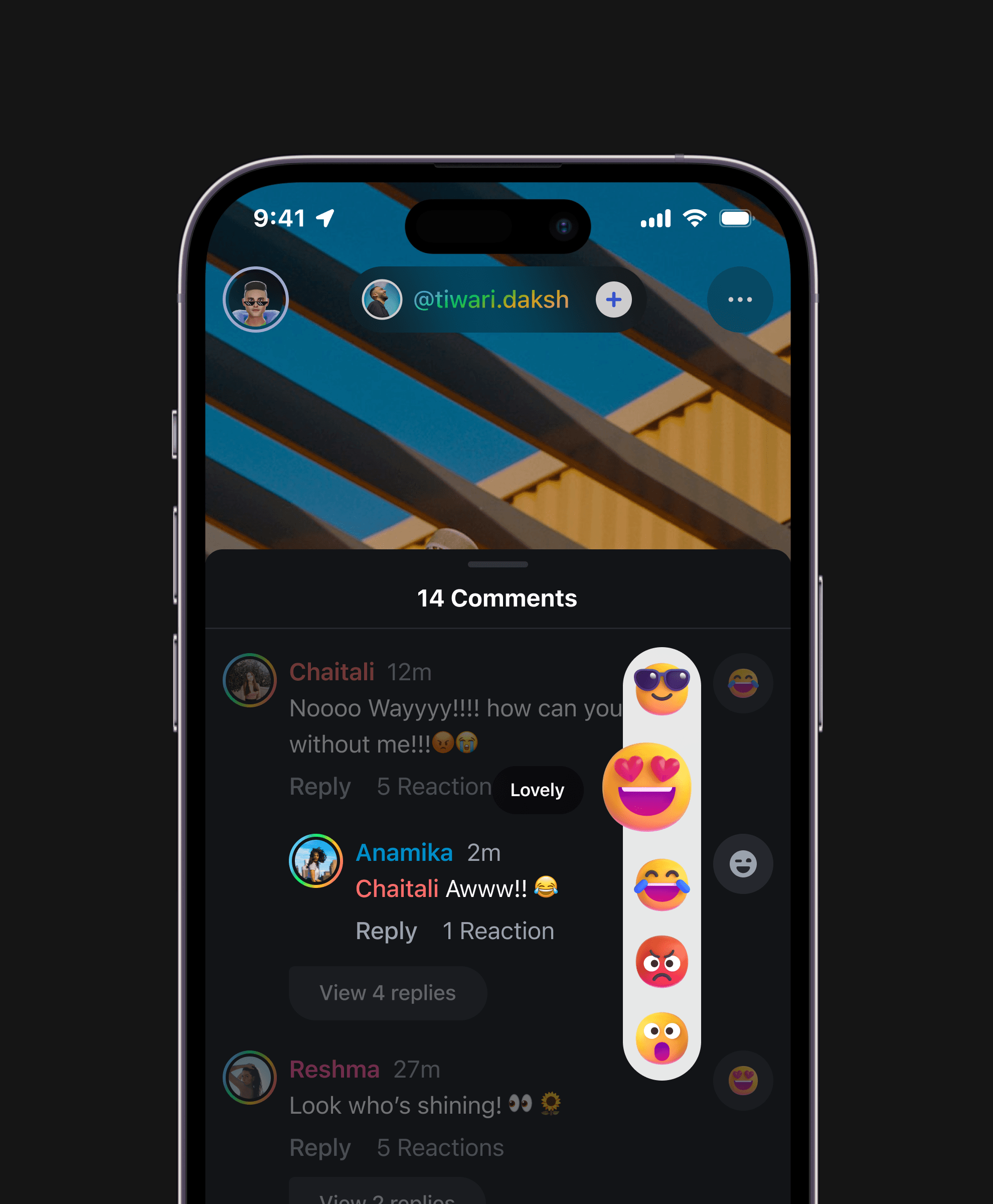
Experience short videos like never before with Flicks - explore, engage & purchase
A unique feature that seamlessly integrates short videos and video commerce; enabling users to easily purchase products.
It's a one-of-a-kind combination that enhances the user experience and makes shopping more interactive and convenient.
FEATURE 4
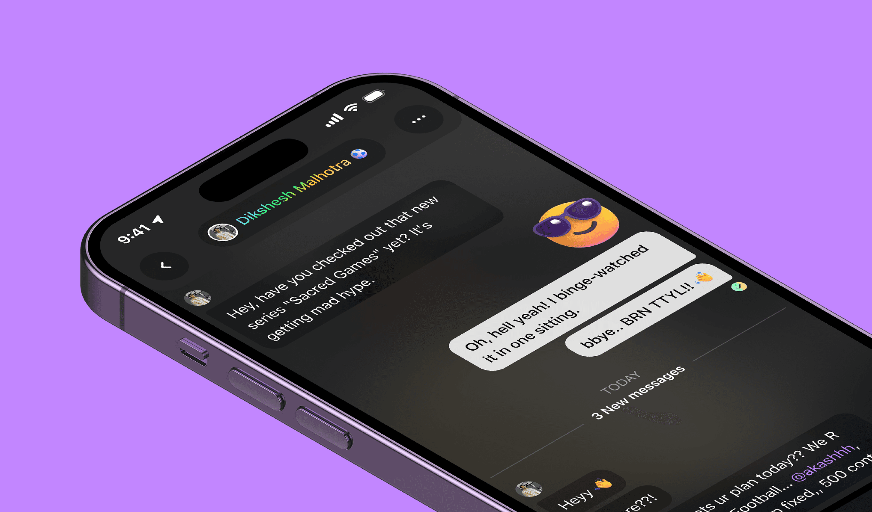
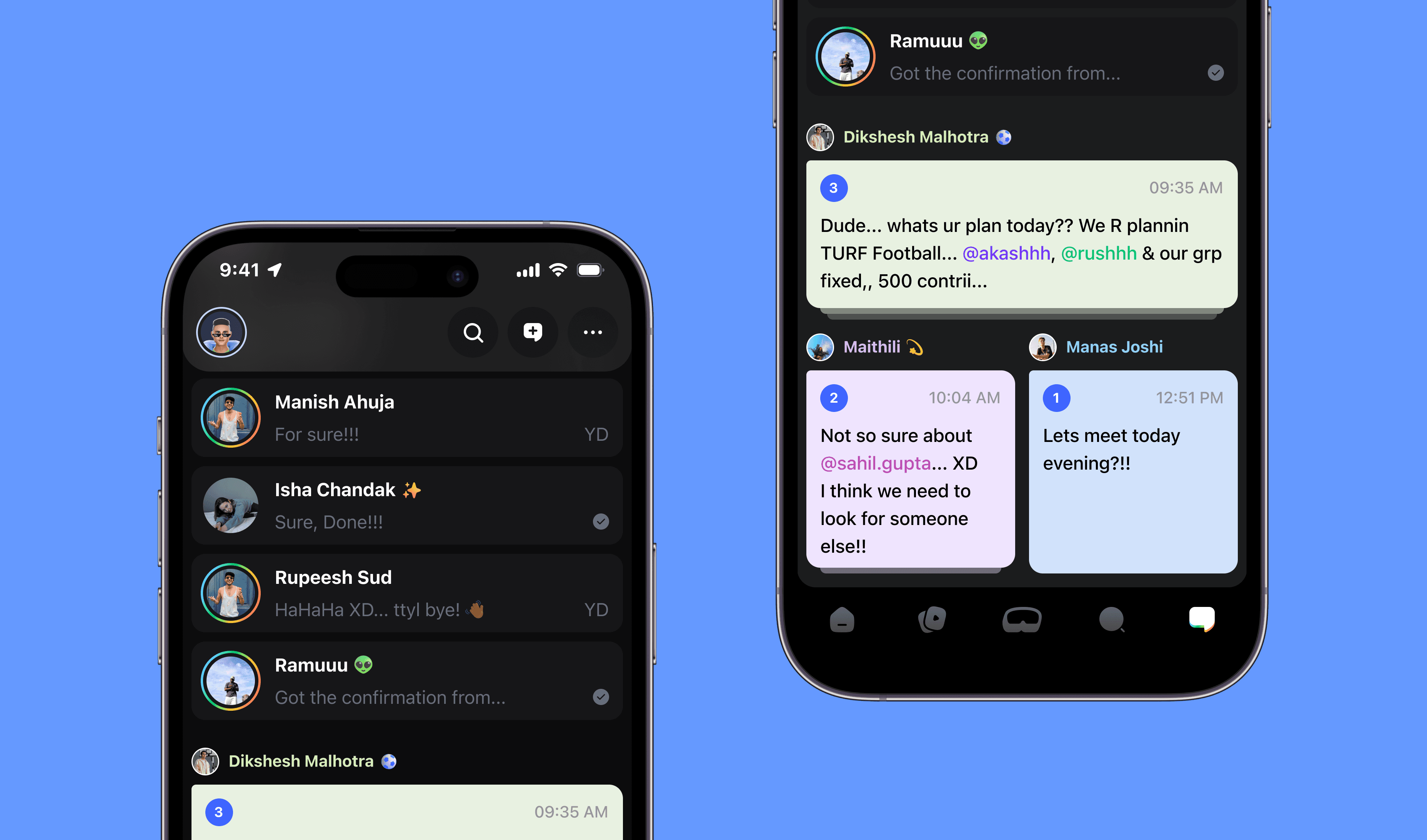
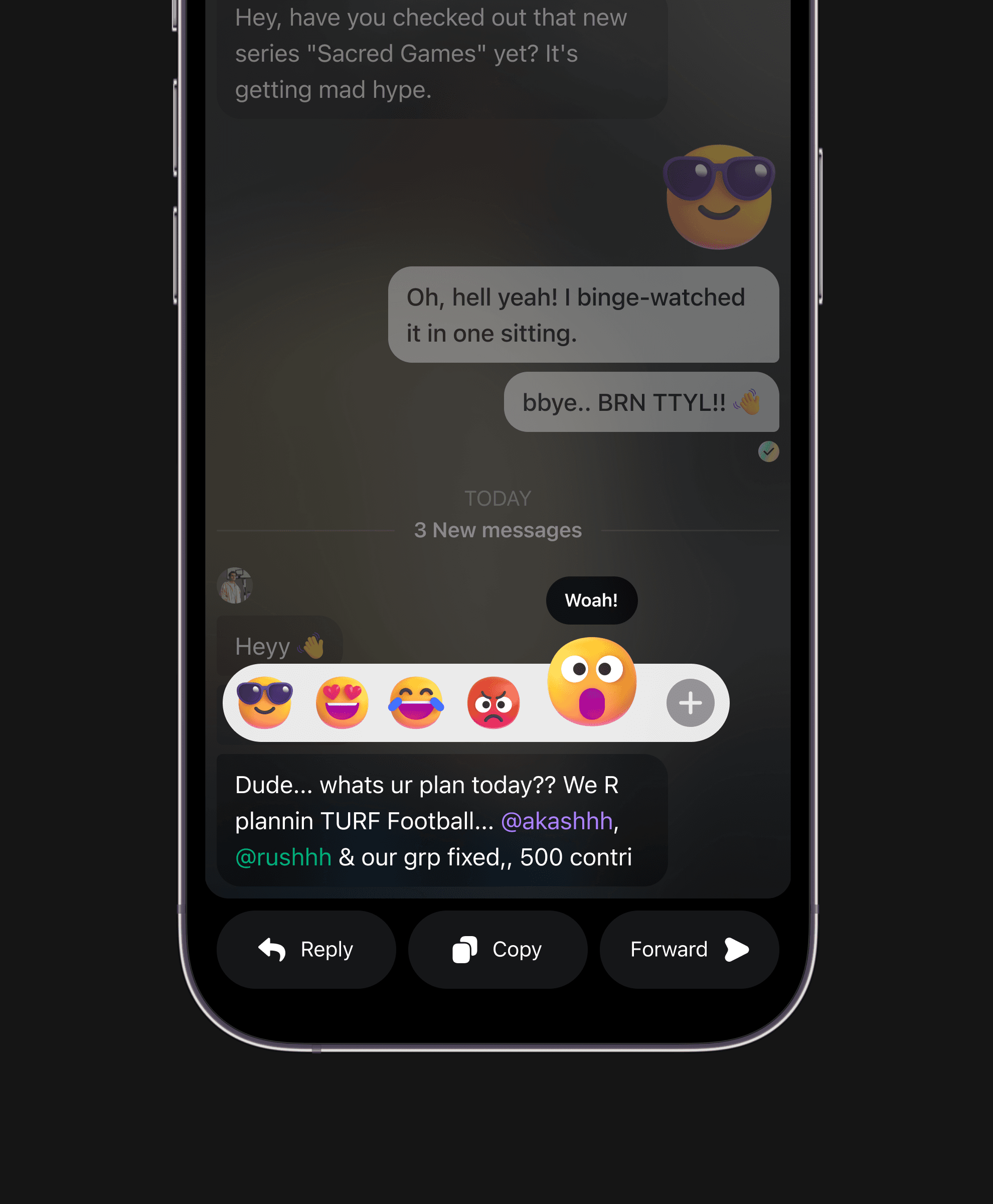
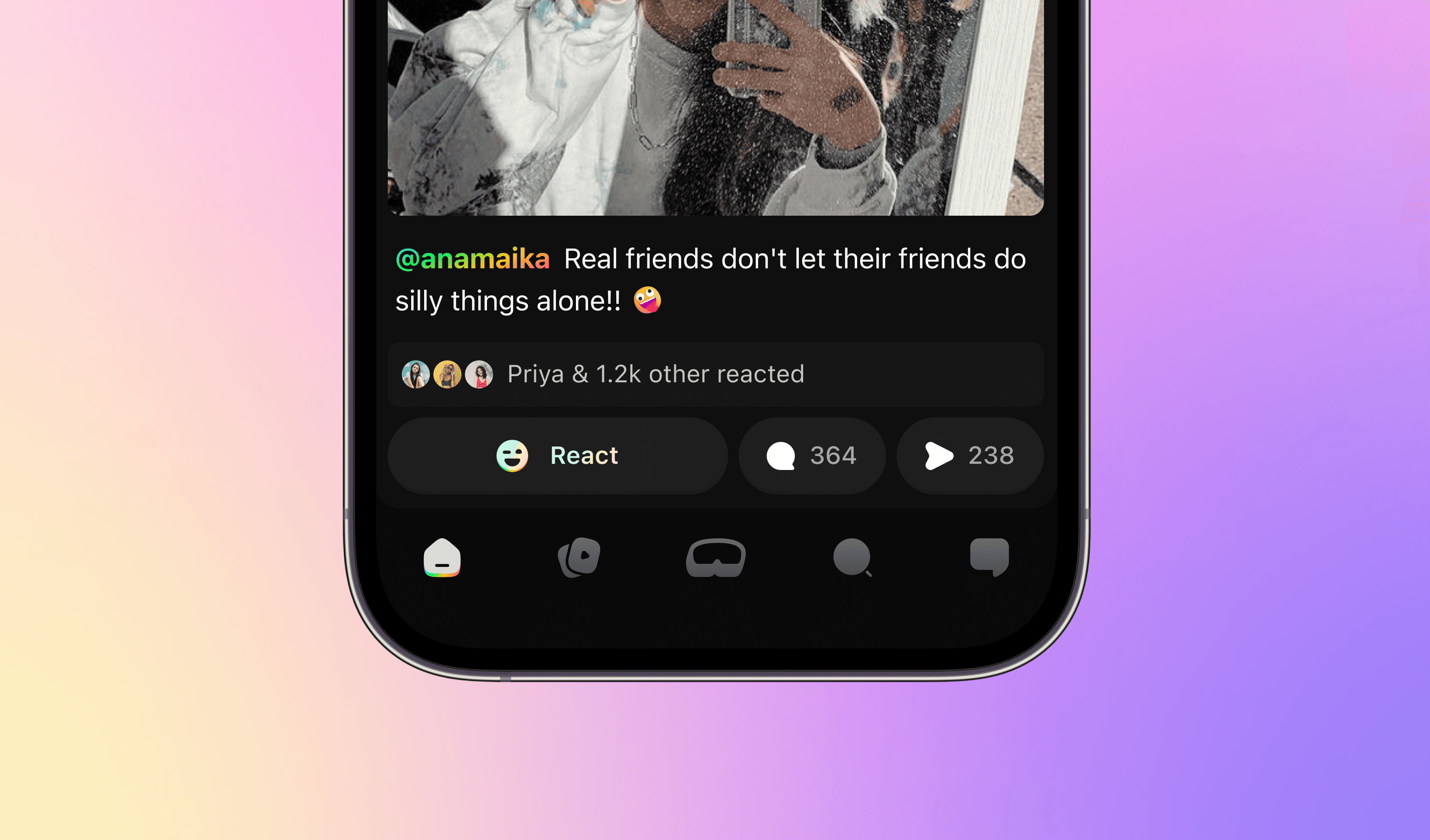
Socialize & engage with your buddies through Messages
A whole new, fresh & engaging experience to interact with your buddies.
Unique notifications and vibrant yet calm colours enhance the chatting experience, making it more interactive & enjoyable.
FEATURE 5
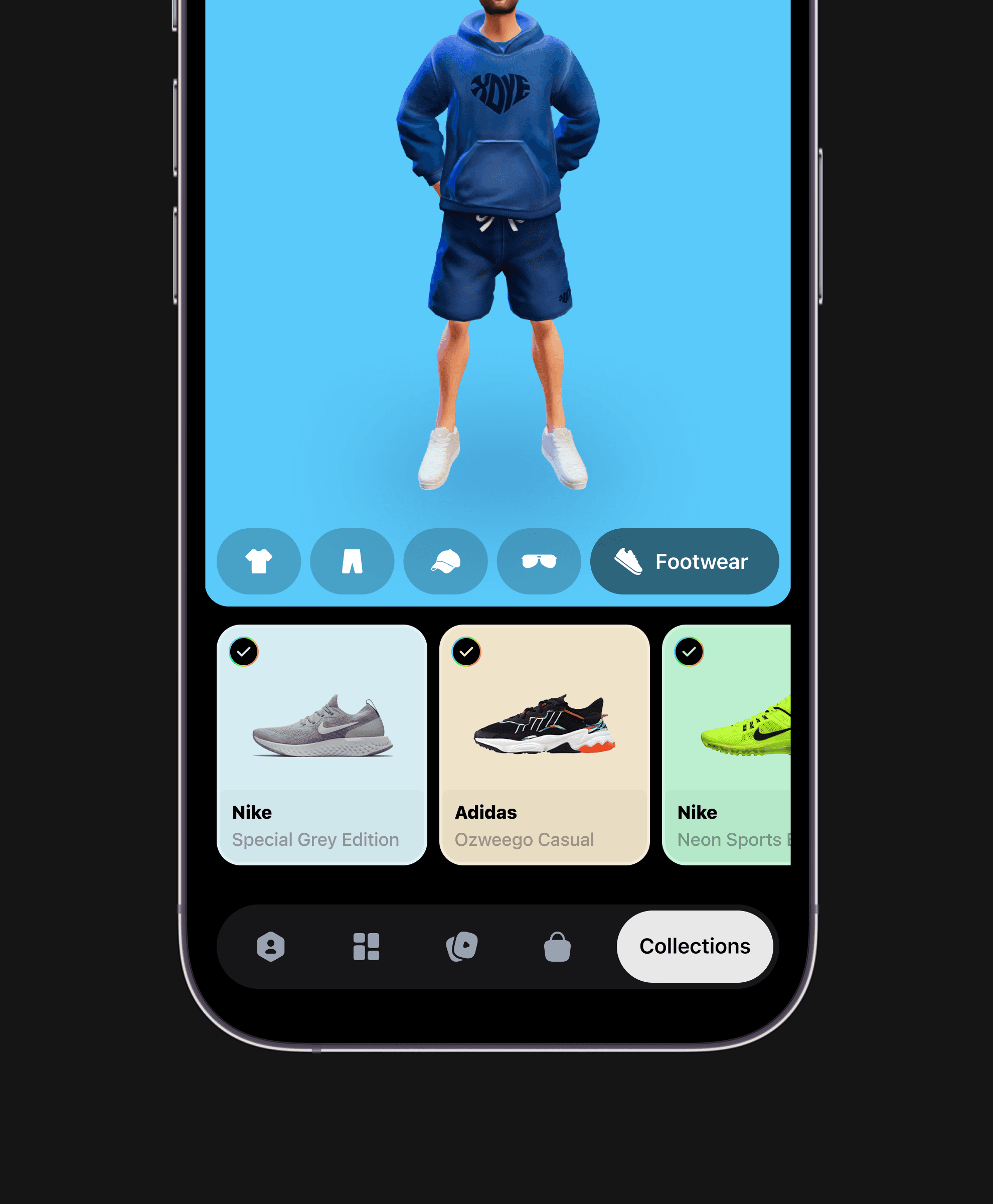
Express your personality & flex your real-life collections through Profile Avatars
Enables users to express themselves & show their real-life fashion collection to the world through Profile & Avatar.
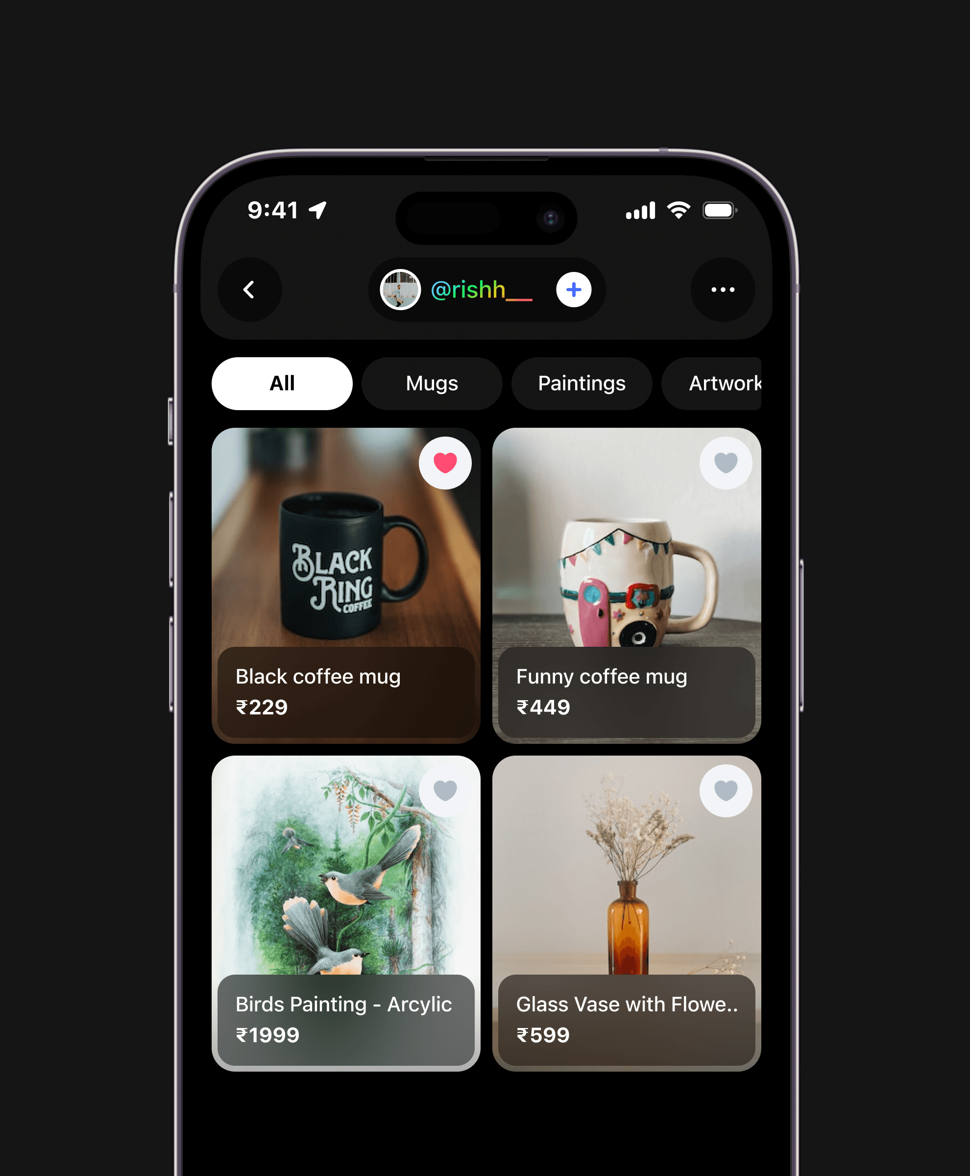
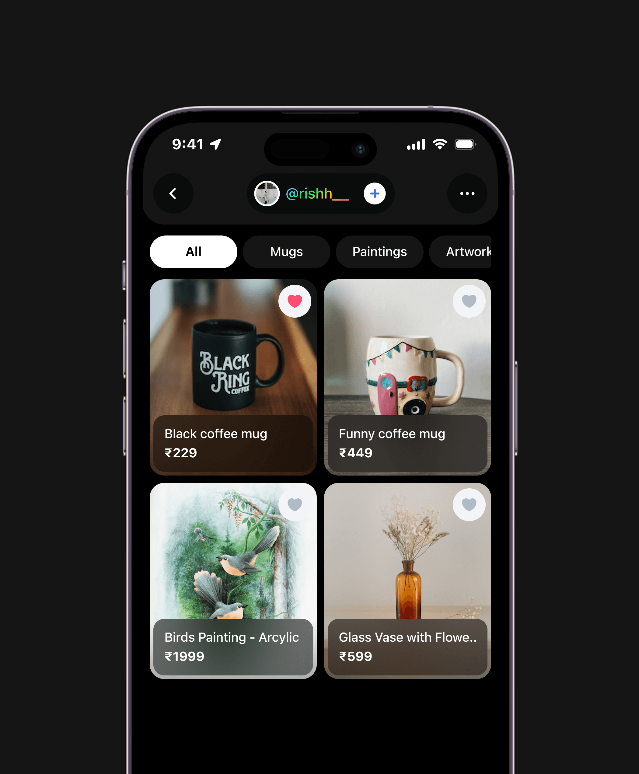
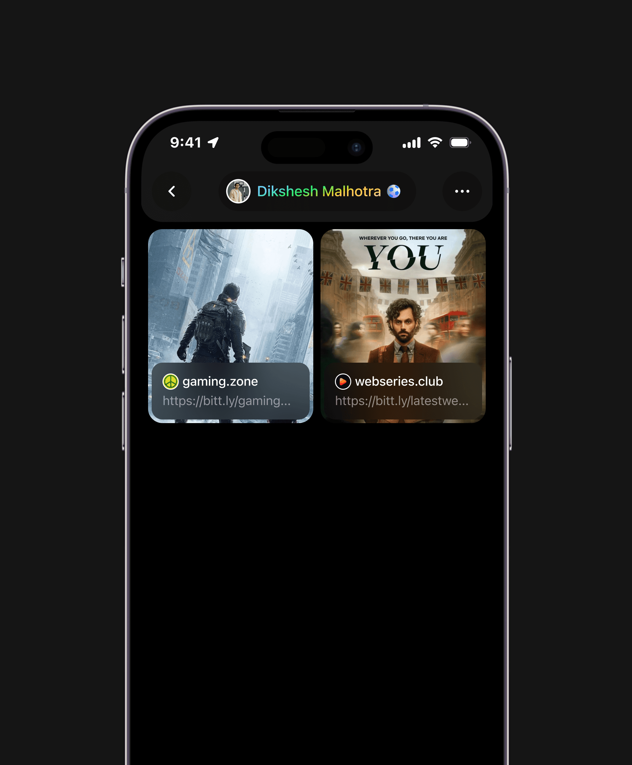
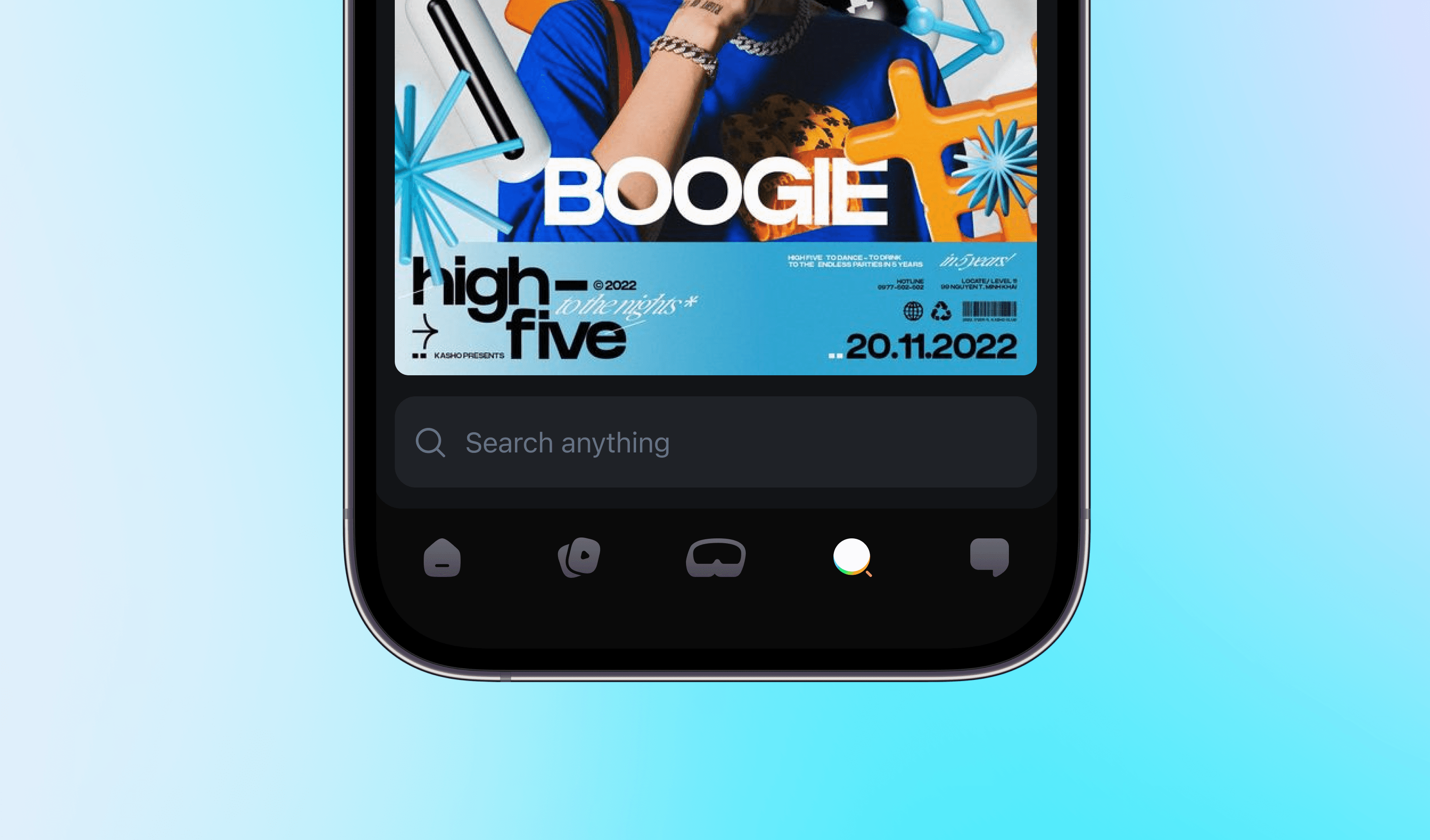
Other screens
Some of the other screens & pages designed for Bindrr AR.
Design Portfolio 2023
© Shreyas Deshmukh
That's all for Bindrr AR - thanks for your time!

Designing India’s first Markerless AR based social networking app
Augmented Reality
Social Media
iOS App
ROLE
Founding UX Designer
YEAR
2021 - 2022
Imagine a world where your everyday environment becomes a playground of interactive digital experiences.
Bindrr brings this vision to life & opens endless possibilities for self-expression and social interaction through Markerless AR.
Note: This project is not live. Due to unforeseen circumstances, this ambitious project was not able to come to fruition.
Design Portfolio 2023
© Shreyas Deshmukh
The website is only available on desktop or laptop!